Retail Signage and Wayfinding
Did you ever get lost in a store when you were a child? You might have wandered too far from your family and then gotten confused by the bright colors, sudden noises, and groups of people, none of whom looked familiar. While getting lost in the store will likely always be a daunting experience for young children, people of any age can get lost in a store. Are adult customers also overwhelmed in your store, needing clarification about where to find specific items? It may be time to upgrade your retail signage and wayfinding in your store.
Clear and Consistent Branding
Your store’s signage should be an extension of your brand identity. Consistency in colors, fonts, and logos across all your signage helps reinforce your brand in customers’ minds. When they see your signage, they should immediately recognize it as part of your store’s visual identity. Consider the following:
Example: If your brand features a vibrant red and white color scheme, ensure your signage prominently showcases these colors. Use modern, traditional, or playful fonts that reflect your brand’s personality.
Prioritize Visibility
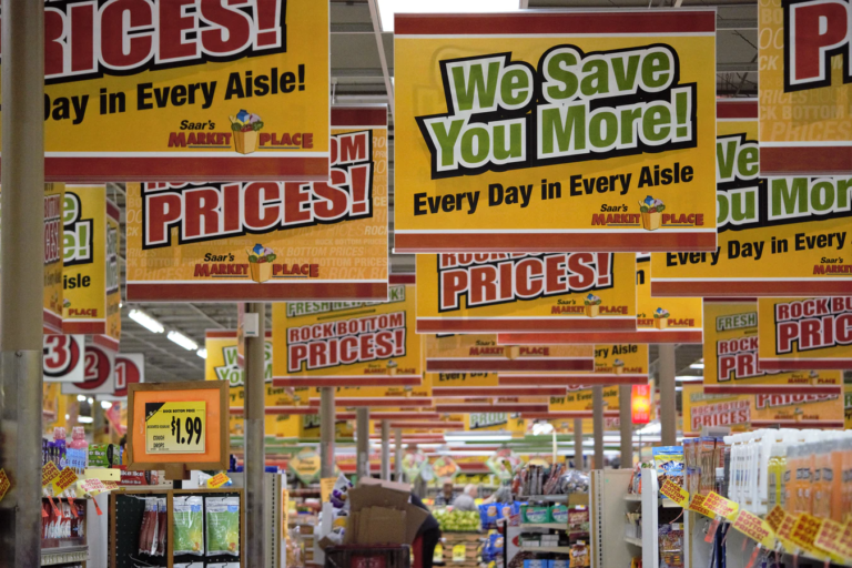
Your signage must grab customers’ attention from a distance, especially in a busy retail environment. To achieve this, choose high-contrast color combinations that stand out. Avoid cluttered signage that can confuse rather than guide. Here’s how you can make your signage more visible:
Example: Opt for bold, contrasting colors like black on yellow or white on a dark background for maximum visibility. Ensure there is sufficient space around each sign to prevent visual clutter.
Strategic Placement
Strategic placement of signage is crucial for effective wayfinding. Position your signs at key decision points, such as entrances, aisle intersections, and near popular product sections. These locations help customers choose where to go next, enhancing their overall experience.
Example: Place a “New Arrivals” sign near the entrance to draw customers’ attention to fresh merchandise. Use arrows to guide them toward popular sections like “Sale” or “Clearance.”

Legible Typography
Your signage should be easy to read and comprehend quickly. Utilize clear and legible fonts, avoiding overly decorative or script fonts that confuse customers. Consider the following typography tips:
Example: Use sans-serif fonts like Arial or Helvetica for maximum legibility. Ensure that the font size is appropriate, with larger fonts for headers and essential information and smaller fonts for additional details.
Information Hierarchy
Organize the information on your signage logically. Place the most critical details at eye level to ensure they capture customers’ attention. Start with the primary message and follow with secondary information.
Example: If you’re advertising a sale, the headline should be the sale percentage, the product category or specific items on sale, and the promotion duration at the bottom.
Digital Signage Integration
Incorporating digital displays can take your signage to the next level. Digital signage allows for dynamic content updates, real-time information dissemination, and customer engagement. Here are some advantages:
Example: Install digital screens near the entrance to showcase product videos, promotional content, and real-time inventory updates. These displays can adapt to changing store needs and create an immersive shopping experience.
Wayfinding Icons and Symbols
Universal symbols and icons can transcend language barriers and make navigation intuitive for all customers. Implementing these symbols in your signage helps streamline the shopping journey.
Example: Use simple arrow icons to indicate directions, restroom symbols for restroom signage, and shopping cart icons to highlight shopping areas.
Lighting for Emphasis
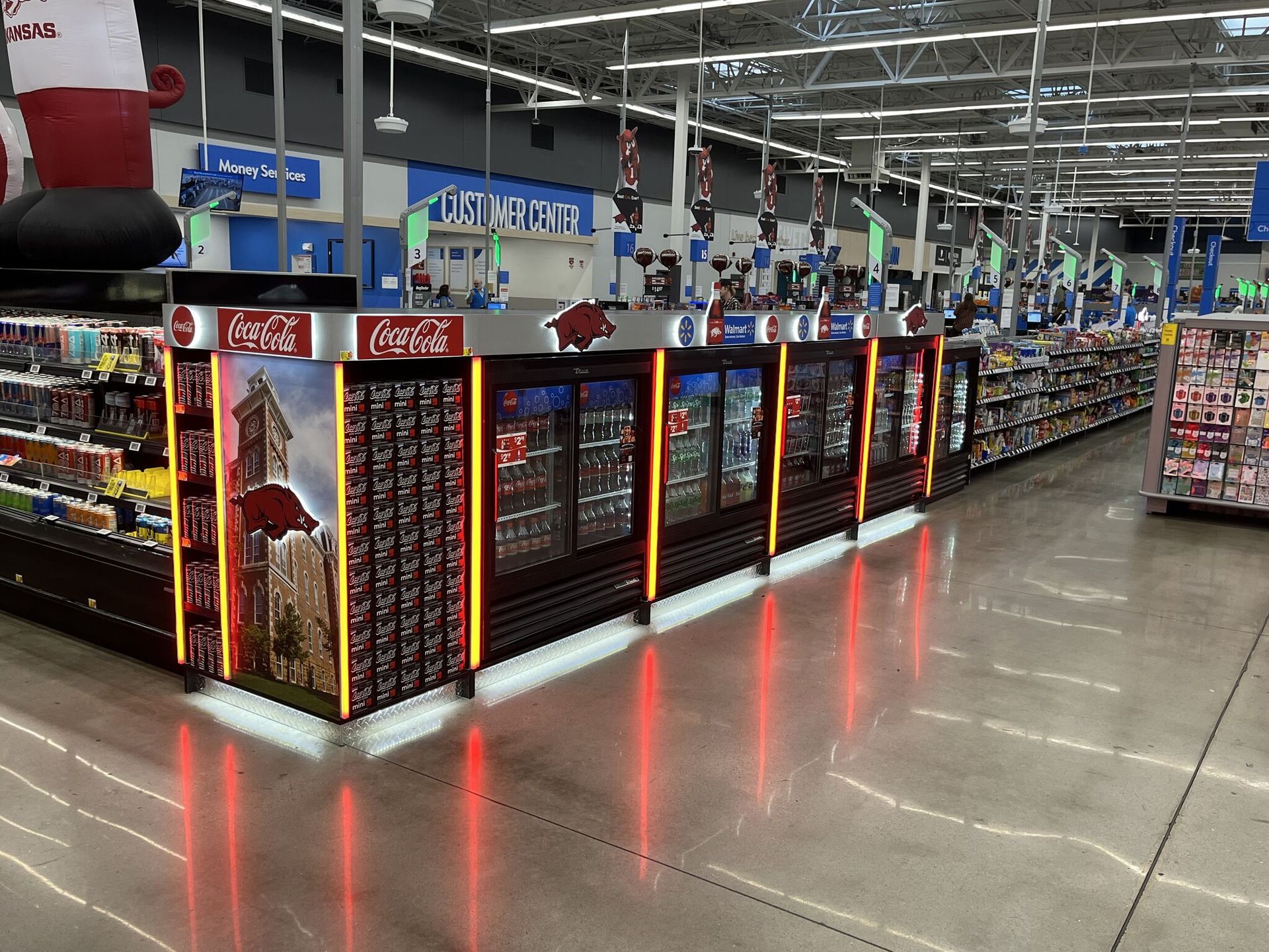
Strategic lighting can draw attention to specific signs or areas within your store. Well-lit signage guides customers effectively and creates focal points that encourage exploration.
Example: Install spotlights or LED strips to illuminate promotional signs or unique displays. Consider track lighting to highlight particular aisles or product sections.
ADA Compliance
Ensuring that your signage meets ADA (Americans with Disabilities Act) requirements is crucial for creating an inclusive shopping experience. ADA-compliant signage includes features like braille and tactile elements for visually impaired customers.
Example: Incorporate braille on signage wherever necessary, such as restroom signs and room numbers. Ensure to position tactile elements correctly, like raised letters for touch reading.
Regular Maintenance
To keep your signage effective, it’s essential to conduct regular maintenance. Periodically assess the condition of your signs and replace any damaged or outdated signs. A well-maintained store not only looks inviting but also functions smoothly.
Example: Assign a staff member to perform routine checks on signage. Replace faded, torn, or broken signs immediately to ensure customers can always access accurate information.

Work With Butler Merchandising
Effective retail signage and wayfinding can significantly impact your store’s success. By implementing these ten tips, you’ll enhance the functionality and aesthetics of your store, boost customer satisfaction, and ultimately increase sales. The key to successful signage and wayfinding lies in creating a shopping experience that is effortless, enjoyable, and memorable for your customers. Start implementing these tips today, and watch your store thrive with improved signage and wayfinding.
If you’re starting to form some ideas for your visual merchandising for the year ahead, don’t hesitate to reach out to our team at Butler Merchandising. We’ve been in business since 1926 and commit daily to quality designs and products. We have in-house design and manufacturing capabilities to get your product to you efficiently. Get in touch with us today!


